How to Communicate Color and Appearance Requirements to Kids’ Optical Frame Suppliers?
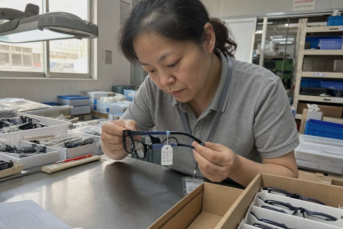
Communicating color and appearance requirements to kids’ optical frame suppliers goes wrong more often than most buyers expect. On our production line, “soft pink” has meant five different pinks.
To communicate color and appearance requirements to kids’ optical frame suppliers, send Pantone codes or physical color chips, define the finish (matte, gloss, translucent), set a Delta E tolerance, approve a signed golden sample, and write acceptance criteria into a technical specification sheet before mass production.
That single paragraph is the summary. The rest of this article breaks each step down so you can apply it to your next order.
How can I clearly describe custom colors to my kids' optical frame supplier without face-to-face samples?
A few years back, a buyer from Australia asked our team for a "translucent blush pink" frame. Our first lab sample came back too peachy. The fix taught us a lot about remote color briefing.
Describe custom colors remotely by combining a Pantone Matching System code, two or three reference photos shot in daylight, a physical color chip mailed to the factory, and directional notes such as "slightly cooler than the reference." Never rely on screen colors or adjectives alone.

Screens lie. Your monitor, your supplier's phone, and the factory office computer all render color differently. So the first rule is simple: never approve or specify color from a screenshot alone. Use a layered approach instead, where each layer backs up the others.
Layer your color references
Start with a Pantone Matching System 1 code. It is the shared language between your design team and the factory's pigment supplier. Then add reference photos, ideally of a real object in natural light, not a digital mockup. Finally, mail a physical chip or a cut of material whenever the color is critical. A physical reference survives every screen and every lighting condition.
Direction words matter too. Instead of "make it softer," say "reduce saturation slightly, keep the same hue." Instead of "more fun," say "shift toward PMS 2905 C." Factories can act on direction. They cannot act on mood.
| Reference type | Reliability | Best use |
|---|---|---|
| Adjectives only ("pastel blue") | Sehr niedrig | Never as the only reference |
| Screenshot or digital mockup | Niedrig | Early concept discussion |
| Pantone / RAL code | Hoch | Formal spec and reorders |
| Physical chip or golden sample | Highest | Final approval and batch matching |
One more point our engineers always raise: the same pigment code looks different on TR90 than on cellulose acetate 2 or TPEE. Injection molding colors sit in the material, while acetate sheet patterns are laminated into the sheet itself. So always tell your supplier which material the color must be matched in, and ask for the lab dip on that exact material.
What details should I include in a technical spec sheet for frame appearance and finish?
There is a trade-off we weigh on every OEM project: a longer technical specification sheet takes more time up front, but it removes almost every argument later. In fifteen years of building kids' frames, the short brief has always cost more than the long one.
A complete technical specification sheet should list the Pantone code per component, finish type (matte vs glossy, frosted, textured), transparency level, logo position and decoration method, packaging appearance, surface defect pass/fail criteria, and the safety tests the finish must survive.
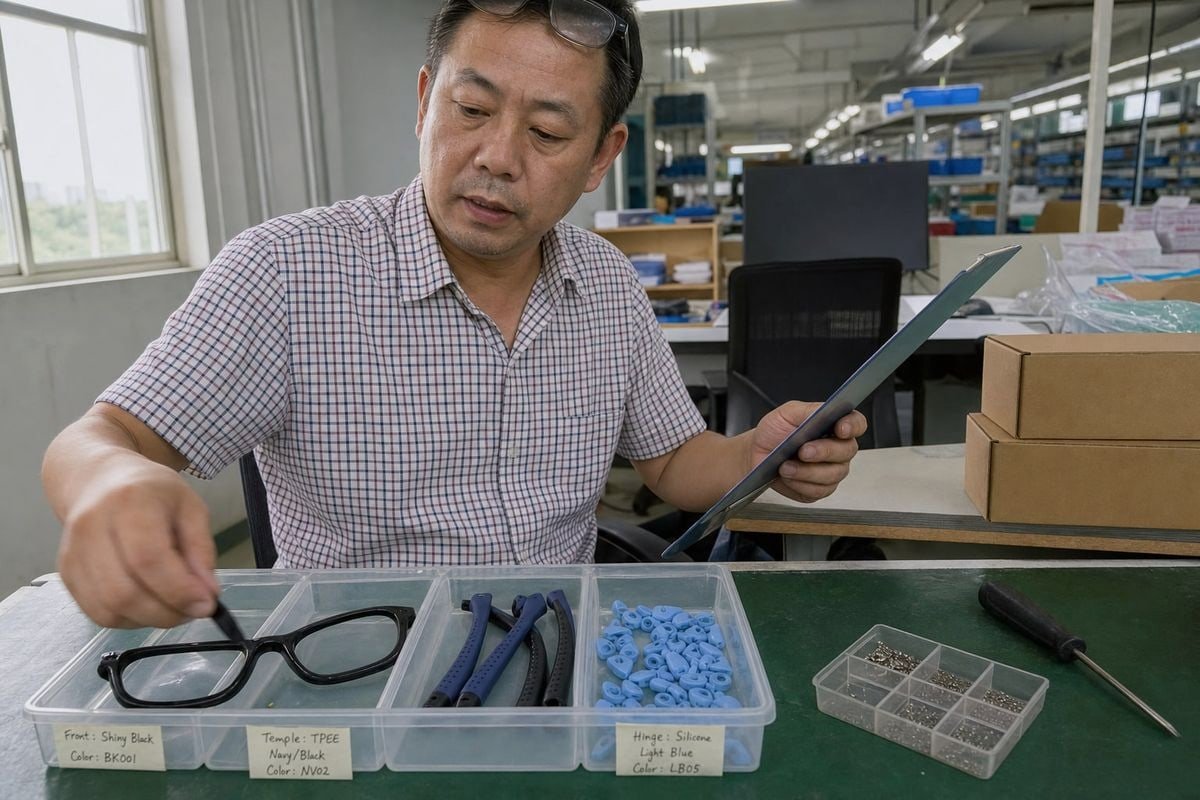
A kids' frame is rarely one color. Take a typical style from our catalog: a glossy black TR90 front, two-tone black and navy TPEE temples with a dotted texture, and light blue silicone hinge connectors and ear hooks. That is four components, three materials, and at least three finishes on one product. If your spec sheet only says "black and blue," you have specified almost nothing.
Break the frame into components
Write one line per component. For each, state the color code, the finish, and the transparency. Matte vs glossy finish is a classic dispute point because "matte" spans everything from soft satin to fully frosted. Define it with a gloss level or a reference photo of an existing product.
| Spec sheet field | Example entry |
|---|---|
| Front frame color | PMS Black 6 C, glossy, opaque |
| Temple color | PMS 2767 C navy + black two-tone, matte, dotted texture |
| Hinge connector / ear hook | PMS 290 C light blue, soft-touch silicone |
| Transparency | Front opaque; if translucent, state haze % target |
| Logo | Pad print, inner left temple, 8 mm, white |
| Coating safety | Non-toxic coatings only; REACH compliance 3 required |
Do not forget the safety layer
Children mouth their frames. Your spec should require non-toxic coatings, REACH compliance for the EU, saliva and perspiration resistance testing so pigment does not leach, and a lightfastness grade so bright colors do not fade in the sun. Add cross-cut adhesion testing 4 for any printed pattern or soft-touch coating, because a peeling coating on a kids' product is an ingestion hazard, not just a cosmetic flaw. Finally, list surface defects that mean automatic rejection: flow lines, bubbles, and uneven pigment distribution.
How do I make sure my supplier's color match stays consistent across bulk production runs?
A repeat customer once reordered a translucent pink acetate style eighteen months after the first run. Because we had kept the signed master sample in our sample room, the second batch matched the first shelf stock. Without it, we would have been guessing.
Ensure batch-to-batch consistency by signing a golden sample, setting a measurable Delta E tolerance of ΔE ≤ 2.0, agreeing on standardized viewing conditions like D65 daylight, requiring in-line quality control inspection during production, and asking for batch photos or inspection reports before shipment.

Color drift is the most common appearance failure in reorders. It is not usually carelessness. Pigment lots vary, raw material resin 5 varies, and molding temperatures shift color slightly. Consistency is therefore a system, not a promise. Here is the process we recommend to every buyer, in order:
- Approve a golden sample. Both sides sign one physical unit. The factory keeps one, you keep one. Every future batch is judged against it.
- Set a Delta E tolerance. ΔE ≤ 2.0 is a common commercial standard for color consistency standards. It replaces "looks about right" with a number.
- Fix the viewing conditions. Color changes under different light. Agree that comparisons happen under D65 artificial daylight or TL84 store lighting, so a sample checked in Taizhou looks the same as one checked in Sydney.
- Inspect during production, not just at the end. Our quality control inspection pulls units mid-run, because catching drift at hour two is cheap and catching it at final packing is not.
- Require batch evidence. Ask for photos of production units next to the golden sample, or a third-party inspection report, before you release the shipment.
The reorder trap
Many buyers approve carefully the first time, then reorder with a one-line email. That is exactly when drift happens. Reference the golden sample number and the original spec sheet in every purchase order. Ask whether the factory can trace which line and which day produced each batch, so any problem can be isolated fast.
Which reference tools or systems can I use to avoid miscommunication over color with an overseas factory?
Early in our export work, we learned that the best briefs from experienced brands all shared one habit: they used standardized tools, not personal descriptions. Our overseas customers who use these systems get first-shot color approval far more often.
Use the Pantone Matching System or RAL codes for solid colors, physical color chips or golden samples for final matching, D65 light booths for evaluation, Delta E measurement for tolerance, and a documented sample approval process with written sign-off criteria.
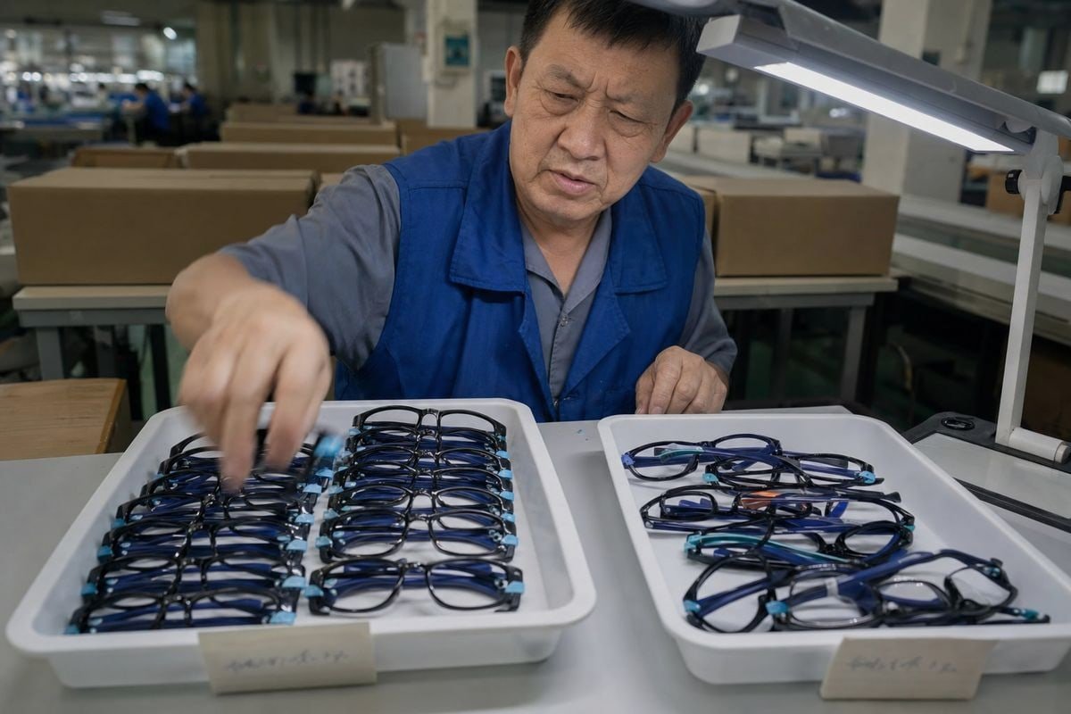
Each tool solves a different failure point in remote communication. Choosing the right one for each stage matters more than owning all of them.
| Tool or system | What it solves | When to use it |
|---|---|---|
| Pantone Matching System / RAL | Subjective color names | Design brief, spec sheet, reorders |
| Physical chips and golden samples | Screen distortion | Final approval, batch comparison |
| D65 / TL84 light booth 6 | Lighting differences between locations | Every color evaluation |
| Delta E measurement | "Close enough" arguments | Setting and checking tolerance |
| Sample approval process with sign-off | Verbal, undocumented approvals | Before every mass production run |
| Supplier catalog and style numbers | Vague style descriptions | Starting from existing designs |
Special cases in kids' eyewear
Two frame types need extra tools. For translucent or "jelly" frames, specify haze and clarity percentages 7, because poorly processed resin looks cloudy and cheap even when the hue is correct. For acetate frames, remember that acetate sheet patterns like tortoise or crystal blush vary between sheet suppliers, so approve the actual sheet swatch, not just a code.
Use your supplier's answers as a filter
The best reference system is a supplier who engages with it. Ask direct questions: Can you match Pantone, or only a factory-standard library? Do you own a light booth? Do you keep a master sample per SKU? A good partner will ask clarifying questions back, repeat key points to confirm understanding, and warn you when a requested finish is hard to hold consistently. A supplier who accepts a vague brief without a single question is the real risk, whatever their price.
Schlussfolgerung
Kids' frame colors are won or lost in the brief. Vague words invite costly drift; Pantone codes, golden samples, written tolerances, and a clear sample approval process protect every batch.
Fußnoten
1. Official site for the global standard in color specification and matching. ↩︎
2. Technical overview of the plant-based plastic commonly used for premium eyewear frames. ↩︎
3. Authoritative European Commission overview of the REACH chemical safety regulation. ↩︎
4. Official ASTM standard for the cross-cut tape test used to evaluate coating adhesion. ↩︎
5. Scientific explanation of synthetic resins used as base materials in manufacturing. ↩︎
6. Industry leader’s page explaining the use of light booths for standardized visual color evaluation. ↩︎
7. Technical definition of haze and clarity in transparent materials, critical for frame quality. ↩︎
Weitere Artikel, die Ihnen gefallen könnten

August 2026
Bio-Based vs Regular Cellulose Acetate: What's the Difference for Kids' Frames?

August 2026
How Recyclable Are Kids' Optical Frame Materials, and What Eco-Friendly Alternatives Exist?

August 2026
Bleichen Kinderbrillengestelle im Lager aus oder altern sie, und wie kontrolliert man die Lagerbedingungen?
Auf der Suche nach einem zuverlässigen Partner für Kinderbrillen?
Entdecken Sie über 800 sofort verfügbare Modelle und umfassenden OEM/ODM-Support, der auf Ihre Marke zugeschnitten ist.
Kontakt aufnehmen English
  Español de México
  Deutsch
  Français
  日本語
日本語  العربية
  Português do Brasil