How to Verify Kids Optical Frames 3D Model Matches Actual Color and Gloss?
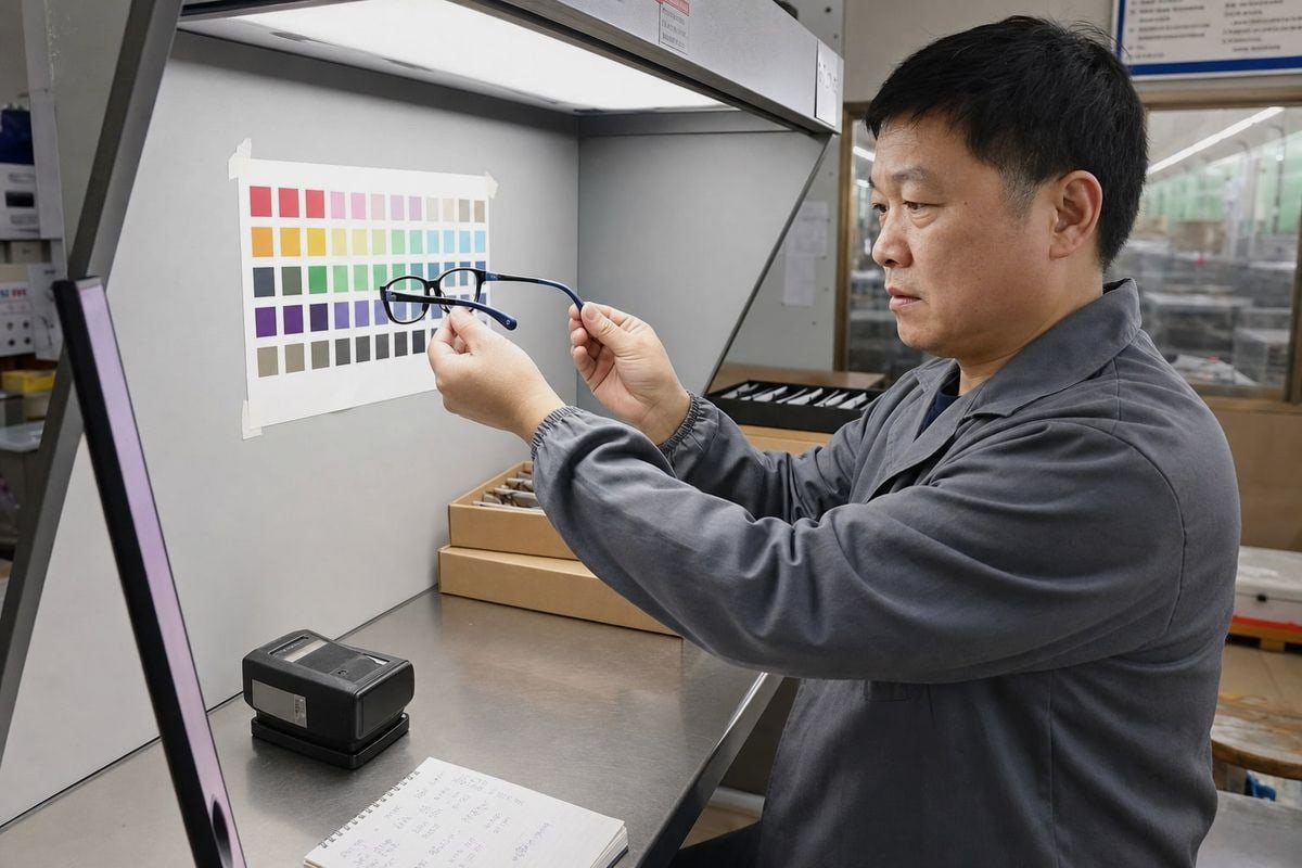
Verifying a kids optical frames 3D model against real color and gloss saves costly rework. On our production line, I have seen approved renders turn into rejected samples.
To verify a kids optical frames 3D model matches actual color and gloss, compare the render and the physical frame under standardized lighting on a calibrated display, measure gloss with a glossmeter, check specular highlights at multiple angles, and confirm results with a pre-production sample.
That is the short answer. Below, I break the process into four practical questions. Each one covers a real step buyers can use before approving any model or sample.
How can I check if a supplier's 3D render truly reflects the final frame color?
Last year, a buyer approved a blush-pink translucent acetate render from us. The first sample looked "too orange" on her laptop. The frame was correct. Her screen was not.
Check a render's color accuracy by requesting the exact material color code, viewing the render on a calibrated monitor under neutral lighting, comparing it against a physical color swatch or Pantone reference, and asking the supplier to show the render in at least two lighting environments.
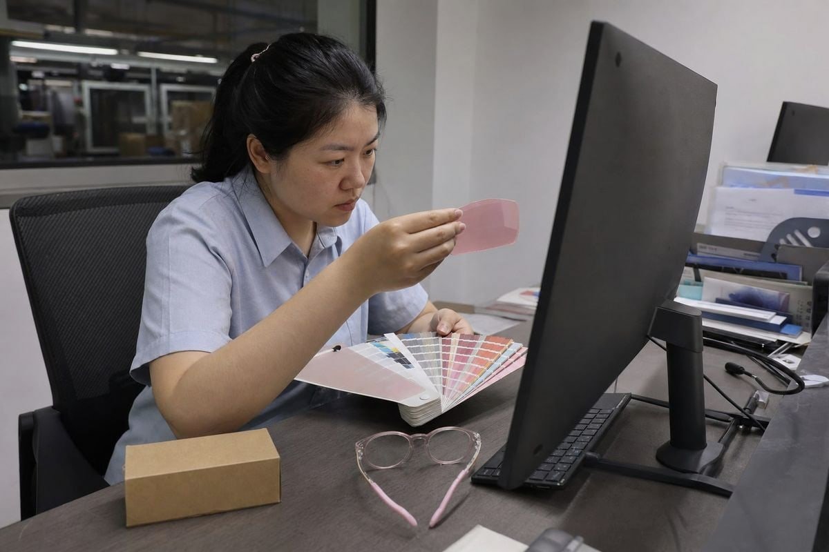
A 3D model can have the correct base color and still look wrong. Lighting, exposure, tone mapping, and display settings all change what your eye perceives. This is why 3D rendering accuracy depends as much on the viewing setup as on the model itself.
Control the variables before you judge the color
In our studio in Taizhou, we render kids optical frames under a standardized D65-style lighting environment 1. D65 mimics neutral daylight and is the common reference in color matching workflows. If your supplier renders under a warm studio light and you view the file in a cool-lit office, the same pink frame can drift toward peach or lavender.
Here is what I recommend you control on your side:
| Variable | Why it matters | What to do |
|---|---|---|
| Display calibration | Uncalibrated screens shift hue and saturation | Use a calibrated monitor 2, not a phone |
| Room lighting | Mixed warm/cool light biases perception | View in neutral, consistent light |
| Reference sample | Memory of color is unreliable | Hold a physical swatch or Pantone chip beside the screen Pantone reference 3 |
| Render environment | Tone mapping can compress highlights | Ask for renders in two lighting setups |
Ask for the underlying data, not just the picture
A serious supplier can share the BaseColor values used in the PBR materials, plus the pigment or masterbatch reference for TR90 or TPEE. When we develop custom colors, we match the digital value to a physical dipped or injected chip first. Color management across devices matters too — a render approved on a design monitor should still hold up in a consumer-facing virtual try-on app. If your supplier cannot explain their color calibration process, treat the render as a sketch, not a promise.
What should I ask for before approving a 3D model based on gloss and finish accuracy?
Gloss is where most approvals go wrong. A buyer once told me our glossy black kids frame "looked matte" in her preview — the roughness setting in the model was simply too high.
Before approving a 3D model, request the roughness and specular settings used, a glossmeter reading or gloss level specification for the real finish, renders under both soft and directional light, and close-up views showing highlights on curved areas like the frame front.
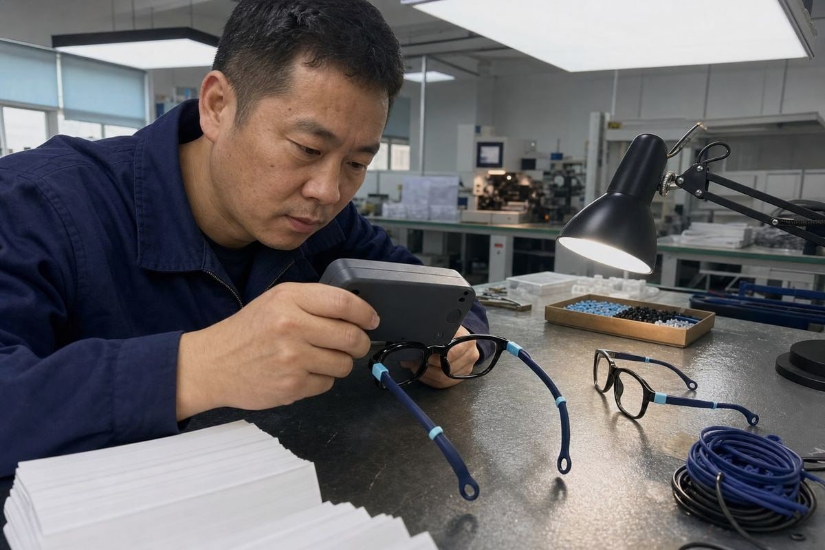
Gloss is not just "shine." It describes how light spreads across a surface. A high-gloss injected TR90 front throws a tight, sharp highlight. A satin-finish TPEE temple spreads that highlight into a soft glow. Material properties simulation in PBR workflows captures this through roughness maps, and small errors here change the whole character of a frame.
A practical request list
Here is what I encourage buyers to ask for, based on fifteen years of eyewear development:
- The gloss target. Ask whether the finish is high-gloss, satin, or matte, and whether it was verified with gloss measurement. Standard practice under ASTM D523 is to take at least three glossmeter readings on a defined area and average them, adding more readings if the spread exceeds two gloss units.
- The roughness map. In PBR materials, roughness controls highlight softness. Ask to see it or at least its value range.
- Multi-light renders. Some material errors hide under soft light and explode under a hard directional light. Request both.
- Per-component finish confirmation. On our two-tone kids frames — a glossy black front with navy rubber TPEE temples — the front and temples have completely different sheen. The model must treat them as separate materials with separate texture mapping.
- Edge and hinge close-ups. Polishing and injection-molding differences change how edges catch light. Curved corners on kids frames are especially revealing.
Plastic is not metal
Reflections tell you a lot. On non-metallic plastics like TR90, reflections stay largely uncolored and strengthen at glancing angles. Metallic-look accents need a different material setup entirely. If a supplier used one generic material for the whole frame, the gloss will never match reality.
Why do my kids optical frames look different in person than in the 3D preview?
A distributor in Australia once sent me a side-by-side photo: our translucent pink frame next to his screen. "Which one is wrong?" he asked. Neither was. The comparison method was.
Kids optical frames usually look different in person because the render's tone mapping shifts highlight colors, the display is uncalibrated, the model lacks the plastic's real translucency and micro-texture, or the reference photos were taken under uncontrolled lighting.
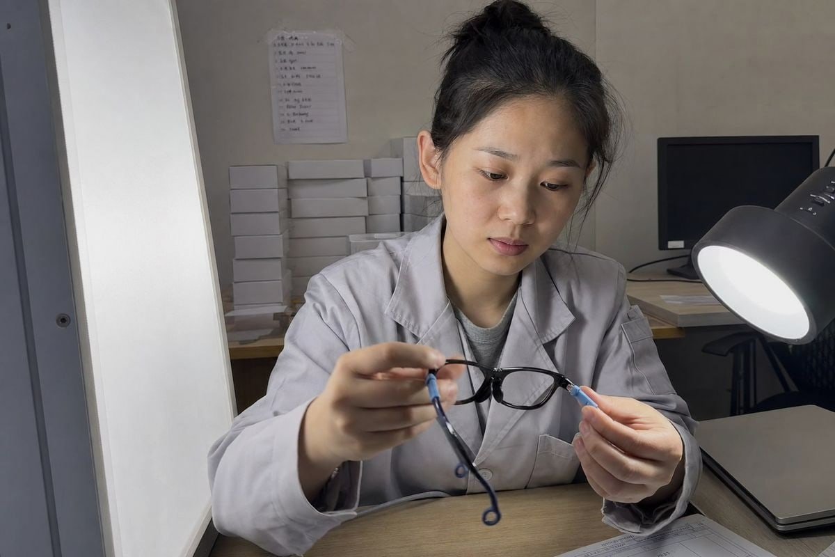
This gap is normal, and it is diagnosable. Product visualization is a simulation, and every simulation makes simplifications. The question is which simplification is causing your mismatch.
The most common culprits
| Symptom | Likely cause | Fix |
|---|---|---|
| Frame looks too shiny or too dull | Roughness value wrong in PBR materials | Retune roughness against a physical sample |
| Saturated colors look washed out | Tone mapping compressing highlights | Adjust exposure/tone mapping; re-render |
| Color shifts between devices | No color management across displays | Judge only on a calibrated monitor |
| Translucent frame looks flat or solid | Missing subsurface scattering / translucency | Add transmission or subsurface behavior to the material |
| Surface looks too perfect | Real frame has molded texture and polish marks | Add subtle normal or texture mapping |
| Everything looks slightly off | Reference photos taken in uncontrolled light | Reshoot under standardized lighting |
Translucency is the hidden trap in kids eyewear
Many of our best-selling children's styles use translucent or milky acetate-look TR90 — like the blush-pink frame with visible depth and light diffusion inside the material. Standard opaque materials in a render cannot reproduce that glow. Light enters the plastic, scatters, and exits. Without subsurface behavior in the model, the render looks like painted plastic, and the real frame looks "different" even though the pigment matches perfectly.
There is also a fair objection here: is exact matching even the right goal? For children's eyewear, how the frame looks on a child's face, under classroom light and playground sun, matters more than a single screenshot. I agree — which is why we judge a match by appearance under intended use conditions, not by one render angle.
Which sample verification steps can I use to confirm color and gloss before mass production?
Every custom color project in our factory ends the same way: a physical pre-production sample on the table next to the approved render. No render, however good, replaces that step.
Confirm color and gloss before mass production by photographing the physical sample under controlled lighting, comparing it to the render on a calibrated display, measuring gloss on flat areas, checking each component separately, and re-testing under both indoor and daylight conditions.
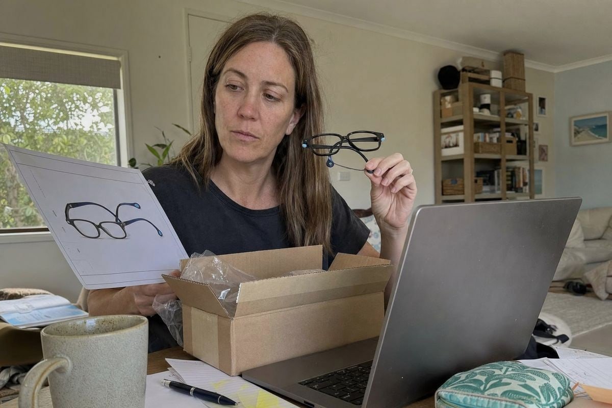
Think of this as digital twin validation in reverse: instead of checking the model against the object, you now check the object against the approved model. In our 5S-managed workshop, this is a fixed step in quality control for every OEM color development.
The step-by-step verification workflow
| Step | Action | Tool needed |
|---|---|---|
| 1 | Photograph the sample under standardized, neutral light | Lightbox or D65 lamp |
| 2 | Record camera settings, white balance, and viewing angle | Any camera with manual mode |
| 3 | Compare sample photos to the render on a calibrated display | Calibrated monitor |
| 4 | Measure gloss on flat surfaces; average three or more readings | Glossmeter (or highlight comparison if unavailable) |
| 5 | Check front, temples, tips, and hinges individually | Physical sample |
| 6 | Rotate the frame: front, side, top; watch highlight positions | Consistent lighting |
| 7 | Re-check under a brighter, daylight-style environment | Window light or daylight lamp |
| 8 | Document everything so the test is repeatable at mass production | Simple written record |
Balance instruments with real-world judgment
Instrument-based measurement is objective but needs equipment and discipline. Visual comparison is fast but subjective. In our experience exporting to buyers in more than twenty countries, the best approach combines both — plus one thing no render captures: wear behavior. Flexible TPEE temples flex, get handled, and pick up micro-scratches on active kids. Rapid eyewear prototyping and pre-production samples reveal these realities early. That is also why we keep around 800 existing styles buyers can physically evaluate before committing to custom tooling — you can hold the real finish before you ever approve a screen image.
If the sample passes all eight steps, sign it off as the golden sample. Every mass-production frame is then checked against it, not against the render.
Conclusion
Renders mislead when lighting, displays, and materials go uncontrolled. Verify color and gloss separately, use standardized comparisons, measure where possible, and always confirm with a golden sample before mass production.
Footnotes
1. Explains the D65 illuminant standard for color-accurate viewing and its importance in color matching workflows. ↩︎
2. Replaced HTTP 404 link with a comprehensive guide on monitor calibration for accurate colors, suitable for creative professionals. ↩︎
3. Replaced HTTP 404 link with a Wikipedia page providing a general, authoritative overview of the Pantone Matching System. ↩︎
More Articles You Might Like

August 5, 2026
Bio-Based vs Regular Cellulose Acetate: What's the Difference for Kids' Frames?

August 5, 2026
How Recyclable Are Kids' Optical Frame Materials, and What Eco-Friendly Alternatives Exist?
August 5, 2026
Do Kids Optical Frames Whiten or Age in Storage, and How to Control Warehouse Conditions?
Looking for a Reliable Kids Eyewear Partner?
Explore 800+ ready styles and full OEM/ODM support tailored to your brand.
Get in Touch English
  Español de México
  Deutsch
  Français
  日本語
日本語  العربية
  Português do Brasil