How to Get Shelf-Ready Retail Packaging When Sourcing Kids’ Sunglasses?
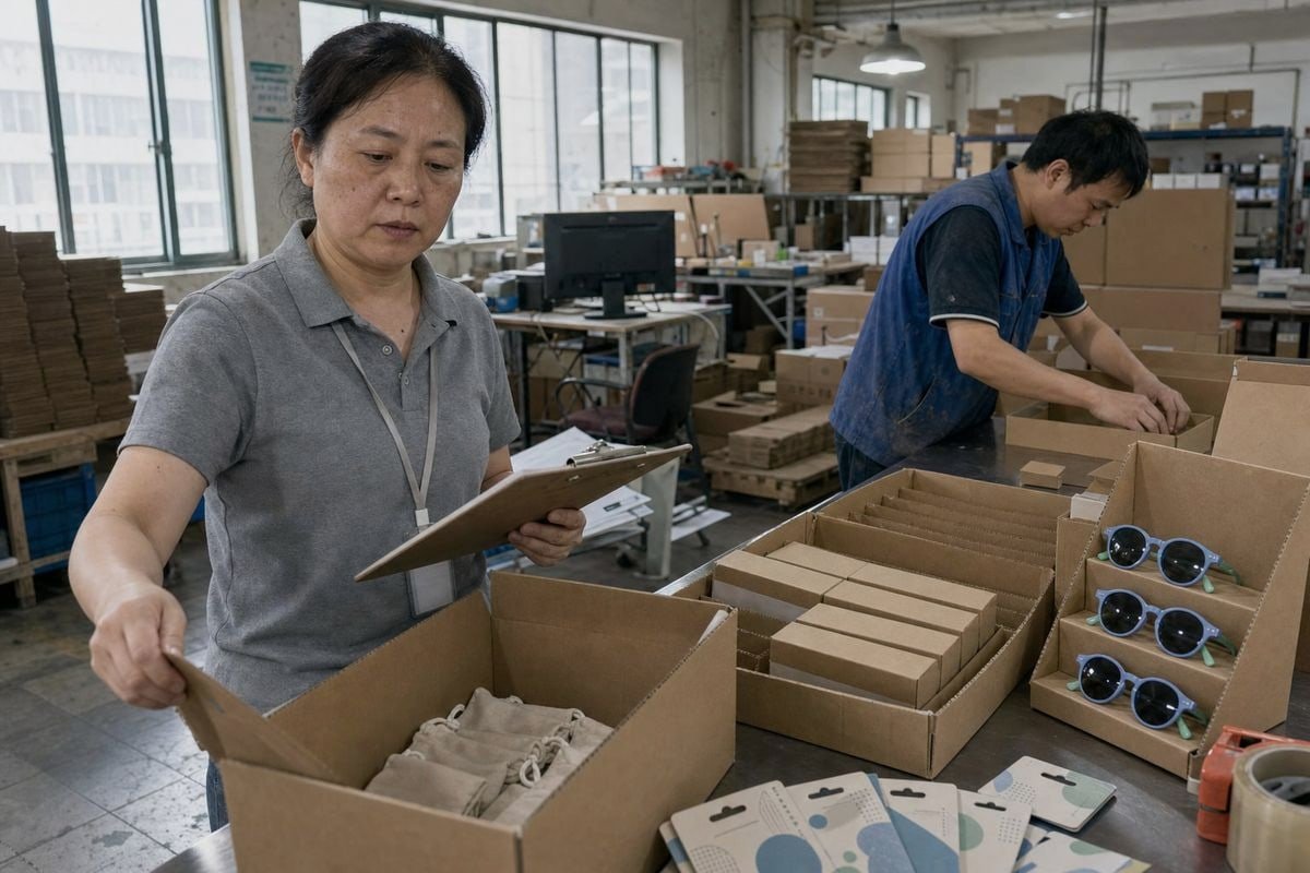
Shelf-ready retail packaging for kids’ sunglasses is where I see many buyers stumble Pantone (PMS) codes 1. On our production line in Taizhou, packaging problems cause more delays than the frames themselves.
To get shelf-ready retail packaging when sourcing kids’ sunglasses, choose a factory with in-house packaging support, select stock display formats to avoid mold costs, approve printed samples before production, specify protective inserts, and lock packaging specs into a signed QC checklist for every repeat order.
Let me break this down step by step. Each section below answers one of the questions buyers ask us most often about retail-ready packaging.
What packaging options can I choose without investing in custom molds or minimums I can't meet?
A buyer from Australia once told me she almost gave up on retail packaging entirely. Every quote she received demanded tooling fees and 10,000-piece minimums. Our team showed her a third path.
You can choose stock-size paperboard boxes, corrugated display trays, printed hang tags with Euro-slot holes, drawstring pouches, and pre-designed counter display units. These formats need no custom molds, accept your branding through printing alone, and typically start at MOQs of 500 to 1,000 units.
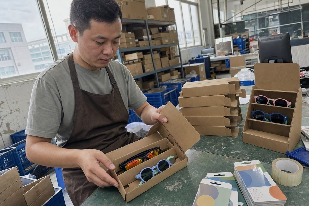
The trick is understanding which parts of packaging require tooling and which do not. Custom plastic blisters and injection-molded cases need molds. Printed paper and cardboard do not. Since we keep around 800 existing frame styles for buyers who want to launch without mold investment, we apply the same logic to packaging. We hold stock dielines for boxes, trays, and hang cards that fit our standard kids' frame sizes. You only pay for printing plates, which cost far less than structural tooling.
Stock formats compared
| Packaging format | Mold needed? | Typical MOQ | Best for |
|---|---|---|---|
| Printed hang card with Euro-slot | No | 500–1,000 pcs | Pegboard retail displays |
| Stock paperboard tuck-top box | No | 500–1,000 pcs | Boutiques, gift positioning |
| Corrugated shipper-to-shelf tray | No | 500–1,000 pcs | Supermarkets, seasonal zones |
| Counter display unit (holds 12–24 pairs) | No | 50–100 displays | Impulse purchase at checkout |
| Microfiber pouch with printed logo | No | 500 pcs | Value-add bundle inside box |
| Custom blister or clamshell | Yes | 3,000–10,000 pcs | Mass retail, established SKUs |
For a first order, I usually recommend combining a printed hang card with a shipper-to-shelf corrugated tray 2. The tray protects frames in transit, then converts to a display with one tear-away panel. Store staff place the whole tray on the shelf. No unpacking. No tooling fees on your side.
One more point. Ask your supplier whether packaging can share artwork across colorways. A modular insert that fits several frame colors lets multiple SKUs share one master carton design. That cuts your printing costs and simplifies restocking for the retailer.
How do I make sure my branding, logos, and colors are applied correctly on retail-ready packaging?
Color drift is the mistake I fear most. Early in our OEM work 3, a pastel-blue frame arrived in a box printed slightly purple. The buyer noticed instantly. We reprinted everything at our cost, and we changed our process permanently.
Provide vector logo files and Pantone color codes, request a digital proof first, then approve a physical printed sample under daylight before mass production. Specify logo position, size, and finish in a written spec sheet, and keep one signed golden sample for comparison on every future order.

Branding accuracy is a process, not a promise. Screens lie about color. A box that looks perfect in a PDF proof can print noticeably different because CMYK printing and screen RGB do not match. That is why we always ask buyers for Pantone (PMS) codes 4 rather than "the blue in the attached photo." Pantone is a physical ink standard. It removes guesswork on both sides.
The approval sequence we follow
- You send vector artwork (AI, EPS, or PDF) plus Pantone codes and a placement guide.
- Our team returns a dieline mockup showing logo position, barcode zone, and safety marking areas.
- You approve the digital proof.
- We produce one physical printed sample and photograph it next to a Pantone swatch.
- You approve or request adjustment. Nothing prints in bulk before this sign-off.
- The approved sample becomes the "golden sample" kept in our workshop for all repeat orders.
For kids' sunglasses specifically, remember what must appear alongside your branding. Retailers expect visible UV400 protection claims 5, CE or applicable regional compliance marks, age guidance, barcode space, and care instructions. If these are missing, some retail chains reject the shipment at receiving. We flag these zones on the dieline before you finalize artwork, because squeezing a barcode in after design approval always looks like an afterthought.
Also think about finish. Matte lamination photographs well and resists fingerprints on shelf. Gloss makes pastel colors pop but shows scuffs. For children's products, we generally suggest matte with a spot-gloss logo. It reads as premium to parents without adding much cost.
What packaging materials and designs actually keep kids' sunglasses safe and protected during shipping?
Drop tests taught us humility. Our TR90 and TPEE frames flex and bounce back, which is exactly why parents choose them. But lenses still scratch, and mirrored coatings scuff if pairs rub together in transit.
Use corrugated master cartons with individual paperboard boxes or molded pulp inserts, keep each pair separated and immobilized, wrap lenses in tissue or microfiber pouches, and choose crush-resistant tray walls. Recyclable paper-based structures protect flexible kids' frames well when the design prevents lens-to-surface contact.
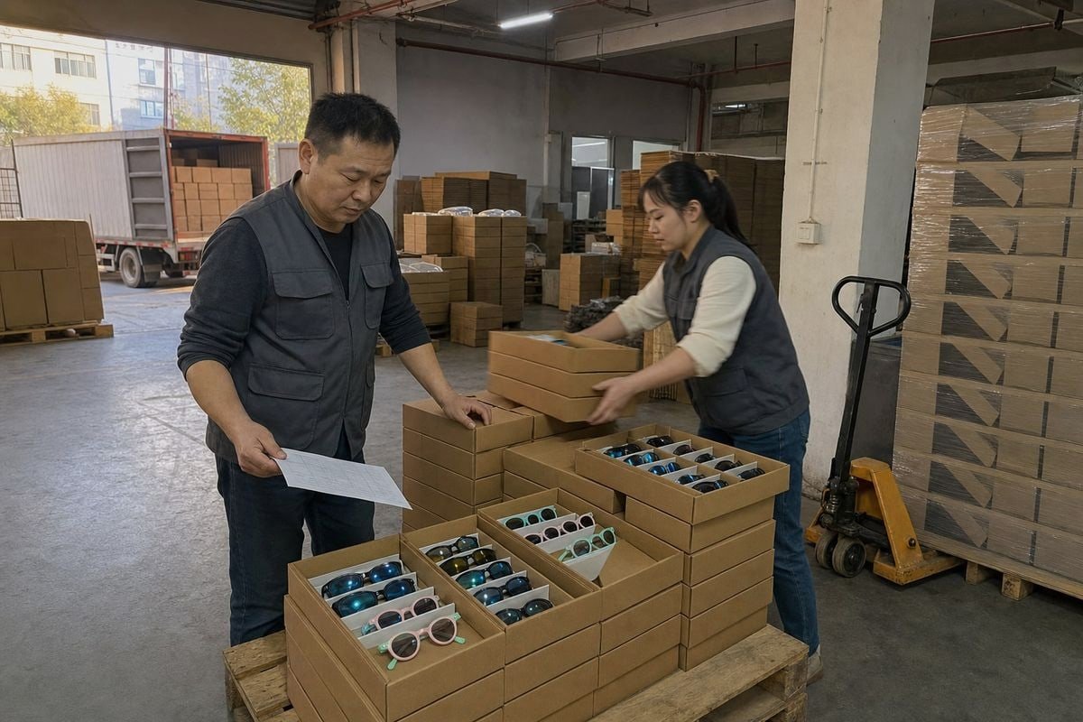
The good news is that kids' sunglasses are light. The risk is not weight damage but abrasion and crushing. A mirrored gradient lens, like the orange-to-teal shield styles we produce, shows every scratch under store lighting. So protection design focuses on three things: separation, immobilization, and stacking strength.
Material choices and their trade-offs
| Material | Protection level | Sustainability | Parent perception | Relative cost |
|---|---|---|---|---|
| FSC-certified paperboard box + tissue | Good | Excellent, fully recyclable | Very positive | Low |
| Corrugated tray with die-cut insert | Very good | Excellent | Positive | Low–medium |
| Molded pulp insert | Very good | Excellent | Very positive | Medium |
| Microfiber pouch inside box | Good for lenses | Reusable, adds value | Positive | Medium |
| PET blister or clamshell | Very good | Weaker unless rPET | Increasingly negative | Medium–high |
Notice the pattern. Paper-based systems now match plastic on protection for lightweight eyewear, and parents buying children's products respond better to minimal-plastic packaging 6. In our experience exporting to Europe, Japan, and Australia, buyers increasingly reject plastic windows entirely and rely on printed product photos or die-cut peek openings instead.
Design details matter more than material alone. We ask three questions on every packaging project. Does the frame sit immobilized, so temples cannot swing and scratch the lens? Do the lenses avoid touching any hard surface? Can the master carton survive a stack of five in a humid container? Then we run a simple validation: pack real product, drop the carton from waist height on each face, and inspect. If a mirrored lens shows any scuffing, we redesign the insert before quoting. It is a cheap test that has saved buyers from expensive claims.
How do I confirm my supplier can deliver consistent, retail-ready packaging on every order, not just the first sample?
Consistency is the quiet differentiator. After fifteen years running our eyewear factory, I can say the first order is easy. Order number four, produced in a rush season with new print operators, is where suppliers get exposed.
Confirm consistency by auditing whether packaging is produced or controlled in-house, requiring a golden sample retention system, writing packaging specs into your purchase contract, requesting pre-shipment photos or third-party inspection against those specs, and reviewing the factory's QC records from previous repeat orders.
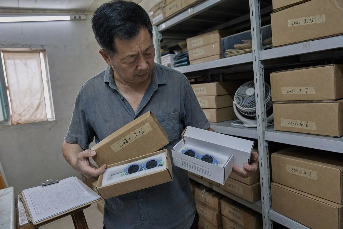
Ask your supplier one revealing question: who actually prints the packaging? Many trading companies outsource packaging to whichever print shop is cheapest that month. That is where color drift, board-weight changes, and misaligned dielines come from. A factory that controls packaging suppliers directly, holds golden samples, and runs a structured workshop, like the 5S system 7 we use across our production floor, can reproduce the same result order after order because the reference and the responsibility sit in one place.
A consistency checklist to put in writing
| Checkpoint | What to specify | How to verify |
|---|---|---|
| Color accuracy | Pantone codes, tolerance limit | Compare against signed golden sample |
| Board strength | GSM or flute grade of corrugate | Include in inspection criteria |
| Print alignment | Logo position within a set tolerance | Pre-shipment photos or AQL inspection |
| Structural fit | Frame immobilized, no rattle | Random shake and drop test per lot |
| Compliance marks | UV400, CE, barcode, age labels | Checklist item on every inspection report |
| Carton labeling | Retailer SKU, quantity, orientation marks | Photo confirmation before loading |
Beyond the checklist, watch how the supplier behaves between orders. Do they proactively tell you when a paper supplier changes? Do they re-confirm artwork before each repeat run instead of assuming? We re-verify Pantone matches on every reorder because ink batches vary, and we send photos of the first packed cartons before the container is loaded. A supplier who resists this level of documentation on a kids' product is telling you something important. Retail buyers do not forgive inconsistent shelves, and neither should you.
Conclusion
Shelf-ready retail packaging turns your kids' sunglasses from a shipped product into a stocked one. Choose stock formats, lock in Pantone approvals, test protection, and demand documented consistency.
Footnotes
1. Official Pantone reference explains the standardized ink system used for accurate print color matching. ↩︎
2. Background on corrugated fiberboard material used for the protective display tray format. ↩︎
3. Explains OEM manufacturing model referenced when discussing factory production processes. ↩︎
4. Background on the standardized ink color system used for accurate packaging branding. ↩︎
5. FDA guidance on sunglasses UV protection standards mentioned as a required label claim. ↩︎
6. EPA resource on reducing plastic use, relevant to the shift toward minimal-plastic packaging. ↩︎
7. Background on the 5S workshop methodology referenced for consistent factory production control. ↩︎
More Articles You Might Like

August 1, 2026
Should Factory Handle Kids Sunglasses Packaging & Labeling, or Use a Designated Supplier?
August 1, 2026
Own Warehouse vs Supplier Direct Fulfillment: Which Cuts Return Costs for Kids Sunglasses Brands?
August 1, 2026
Direct-to-Port Warehouse or Overseas Staging: Which Saves More on Kids Sunglasses Shipping?
Looking for a Reliable Kids Eyewear Partner?
Explore 800+ ready styles and full OEM/ODM support tailored to your brand.
Get in Touch English
  Español de México
  Deutsch
  Français
  日本語
日本語  العربية
  Português do Brasil