How to Set Color Consistency Standards for Kids Optical Frames Across Batches?

Color consistency standards for kids optical frames decide whether your second order matches your first calibrated spectrophotometer 1. On our production line in Taizhou, I have seen one mismatched pink batch nearly cost a buyer a retail listing. That risk is avoidable — with a repeatable color-control system.
To set color consistency standards for kids optical frames across batches, approve a physical golden sample on the actual frame material, record its L*a*b* values, define a Delta E tolerance (often ≤1.5–2.0), specify viewing lighting like D65, and verify every batch against that master before shipment.
That is the short answer. Below, I will walk you through each stage: setting tolerances, choosing measurement tools, briefing your factory, and handling a bad batch when it arrives.
How can I define acceptable color tolerance levels before mass production begins?
A buyer from Australia once told me her translucent pink frames "looked like three different products" across two reorders. The root cause was simple: no color tolerance had ever been agreed in writing before mass production started.
Define color tolerance before production by approving a physical master sample in the real frame material, recording its Lab* values, and setting a Delta E limit — typically ΔE ≤1.5 for brand-critical visible colors and ΔE ≤2.0–3.0 for less critical parts — validated by visual checks under D65 lighting.

Tolerance is not one number. It is a layered standard. In our 15 years making children's eyewear, the programs that stay consistent across seasons always define three levels of reference, not just a Pantone code 2.
Build a layered color standard
- Primary standard: a physical golden sample approved on the actual substrate — TR90, TPEE, acetate, or silicone — not a paper swatch.
- Secondary standard: measured Lab* values 3 from that sample, recorded with the instrument settings used.
- Tertiary standard: written rules covering gloss, surface finish, streaking, speckling, and part-to-part matching.
Why layered? Because a Pantone chip is opaque coated paper. A translucent blush-pink acetate frame, like the jelly-finish style we produce, will never read identically to that chip. Material science matters here: pigment loading, resin lot, and light transmission all shift how the same formula appears. The standard must be material-specific.
How tight should the tolerance be?
Tolerance depends on visibility, brand positioning, and material behavior. Here is the framework I recommend to buyers:
| Component type | Suggested ΔE tolerance | Reasoning |
|---|---|---|
| Hero front frames, visible outer surfaces | ≤1.0–1.5 | Most observers notice ΔE above ~1.0 side by side |
| Standard visible parts (temples, tips) | ≤2.0 | Close match; minor drift acceptable |
| Translucent or textured finishes | ≤2.5–3.0 | Light transmission widens perceived variation |
| Hidden parts, inner surfaces | ≤3.0+ | Not brand-critical; avoid over-paying for precision |
There is a real tension here. Some buyers demand ΔE ≤1.0 on everything. I push back on that, honestly. Multi-part kids' frames — like our two-tone models with a glossy black front, navy rubber temples, and light blue silicone tips — combine rigid and flexible materials that accept pigment differently. Demanding lab-grade uniformity across all of them inflates cost and rejects usable product. The practical middle ground: tight tolerance on hero colors, defined and documented bands elsewhere, and always a visual validation under expected retail lighting. Numbers set the guardrails; human eyes confirm real-world acceptability.
What tools or methods should I use to measure color consistency between batches?
When we calibrate color checks in our 5S-managed workshop, we never rely on memory or a phone photo. Human color memory fades within seconds; instruments do not.
Measure batch color consistency with a calibrated spectrophotometer reporting Lab* values and Delta E against the golden sample, combined with side-by-side visual inspection in a light booth under D65 and warm retail lighting. Record every reading by batch, date, and production line.

Spectrophotometry turns color into repeatable numbers. That is the foundation of any serious quality assurance protocol. But instruments alone are not enough, and I want to explain why with a real scenario. We once measured two temple batches that both passed ΔE ≤1.5 against the master. Under warm store lighting, one still looked slightly greener. That is metamerism — two colors matching under one illuminant but diverging under another. Only the light booth caught it.
The tools that matter, and what each one does
| Tool or method | What it catches | Limitation |
|---|---|---|
| Spectrophotometer | Numeric drift in hue, lightness, saturation | Misses gloss, texture, metamerism effects |
| Light booth (D65 + warm light) | Real-world appearance, metamerism | Subjective without trained inspectors |
| Gloss meter | Sheen differences that alter perceived color | Does not measure hue at all |
| Retained golden sample | Long-term drift across reorders | Can fade if stored poorly; reseal periodically |
| Batch photo records | Traceability, dispute evidence | Camera color is not reliable for judgment |
A practical measurement workflow
- Calibrate the instrument before each session. Uncalibrated equipment is a silent source of false passes.
- Measure at least three units per batch, on the same location of each frame.
- Use consistent settings: D65 illuminant, 10° standard observer, same aperture.
- Compare readings to the recorded master values, not to the previous batch. Comparing batch-to-batch lets drift accumulate invisibly.
- Confirm visually in the booth, side by side with the sealed golden sample.
- Log results by batch number, supplier, date, and line for full traceability.
One more point buyers often miss: gloss and surface finish need their own check. A frame can match in hue and still look wrong if the sheen differs. On glossy black fronts — like our sporty rounded-rectangle kids' style — a gloss drop of even a few units reads as "faded" to a parent in a shop. Measure appearance as a package, not hue alone.
How do I communicate my color standards clearly to my frame manufacturer?
Over 15 years supplying kids' eyewear brands in 20+ countries, I have learned that most color failures are communication failures. The factory did what it understood — the buyer just assumed something different.
Communicate color standards through a written specification attached to every purchase order: SKU and color name, material and finish, master sample ID, Lab* target values, Delta E tolerance, lighting conditions, and pass/fail criteria. Require an approved pre-production sample before bulk runs.
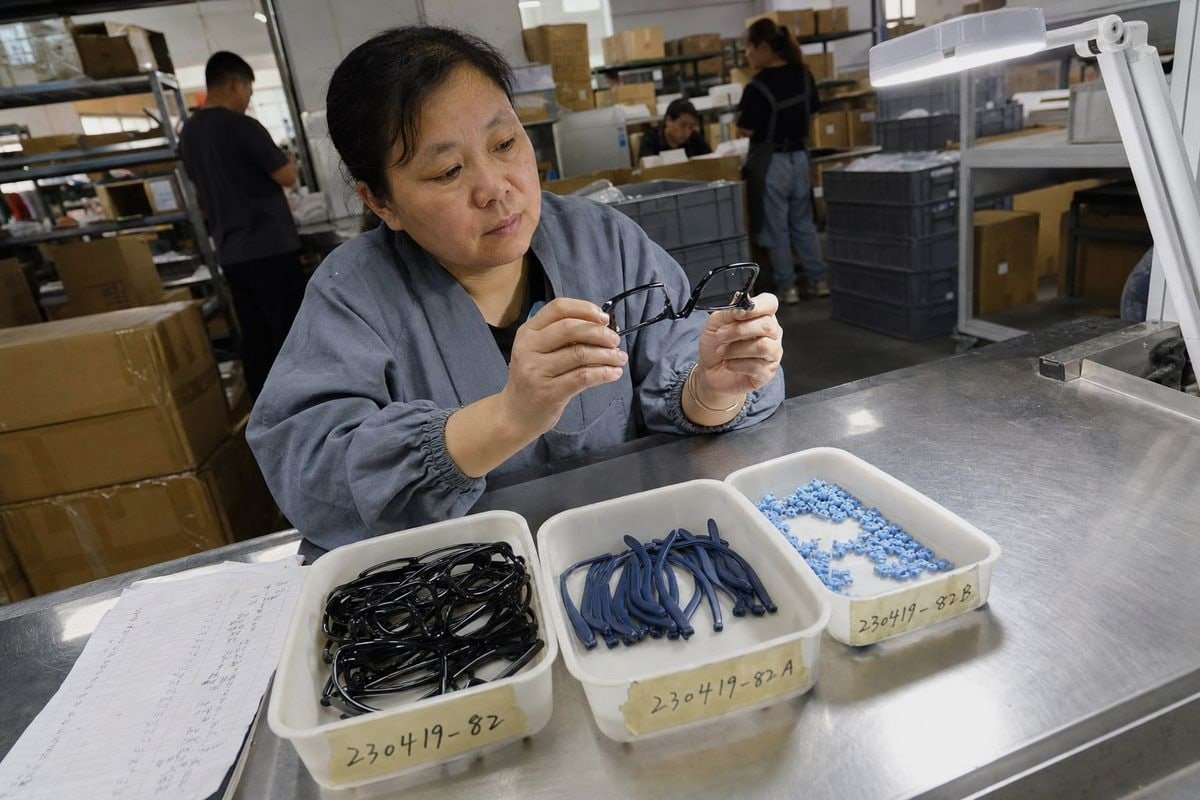
Clear communication starts with a document, not a conversation. Verbal agreements about color do not survive staff turnover, factory handoffs, or a six-month gap between orders. When our OEM/ODM team develops custom colors for a client — say, a pastel pink acetate with matte silicone tips — we lock everything into a specification sheet both sides sign.
What your color specification should contain
| Specification item | Example entry |
|---|---|
| SKU and color name | KD-2041 / Blush Pink Translucent |
| Material and surface finish | Acetate front, glossy; silicone tips, matte |
| Master sample ID and location | GS-2041-P, sealed, held by buyer + factory |
| Pantone reference | 705C — starting point only, not acceptance basis |
| Measured Lab* values | Recorded from approved golden sample |
| ΔE tolerance | ≤1.5 front frame; ≤2.5 silicone tips |
| Viewing conditions | D65 primary; warm 3000K secondary check |
| Visual pass/fail criteria | No streaking, speckling, or part mismatch |
Build the standard into the working relationship
Beyond the document, three practices keep everyone aligned. First, require a strike-off or pre-production sample for written approval before any bulk run — this is standard in our process and it catches problems while they are still cheap to fix. Second, ask your supplier to disclose pigment or resin changes. Raw material consistency drives batch consistency; a new colorant lot with weaker pigment stability can shift tone even when the recipe is unchanged. Requesting a certificate of analysis for colorant batches is a reasonable ask. Third, confirm that color decisions never compromise safety requirements. For children's products, hypoallergenic materials, impact resistance, and regulatory compliance for your target market come first; a pigment change should never be approved without checking it still meets those standards. UV stability 4 also deserves a line in the spec — kids' frames live outdoors, and a color that drifts after months of sun exposure fails the parent, even if it shipped perfectly.
What steps can I take if I receive a batch with noticeable color variation?
A distributor in Europe once emailed me photos of temples that looked "off" against her previous stock. Before anyone panicked, we followed a structured process — and it turned out half the issue was her warehouse lighting.
If a batch shows color variation, document it immediately with side-by-side photos against the master sample, measure the Delta E deviation, notify the factory with batch numbers and data, then negotiate a resolution — rework, replacement, credit, or conditional acceptance — based on the agreed tolerance.

Speed and evidence matter here. A vague complaint like "the blue looks wrong" gives your supplier nothing to act on. A documented deviation with numbers gives them everything.
The step-by-step response process
- Quarantine the batch. Do not mix it with existing stock. Batch variation spreads confusion fast once cartons are shelved together.
- Verify under controlled lighting. Check against the sealed golden sample under D65 first, then warm light. Warehouse fluorescents distort color badly.
- Measure the deviation. Get Lab* readings from at least three units. If ΔE sits within the agreed tolerance, the batch may be contractually acceptable even if it feels different.
- Document everything. Side-by-side photos, instrument readings, batch numbers, carton labels, and dates. This is your negotiation basis.
- Notify the factory in writing. Send data, not emotion. In our experience, factories respond faster and more cooperatively to a ΔE report than to an angry email.
- Agree a resolution. Options range from full replacement to partial credit to conditional acceptance for less visible SKUs or promotional channels.
- Fix the root cause. Ask what changed — pigment lot, resin supplier, molding temperature, coating line. Then update the specification so it cannot recur.
When is variation actually acceptable?
Be honest about severity. If the deviation is outside tolerance on a hero color, reject or rework. If it is inside tolerance but visible only under lab conditions, accepting it with a documented note is often the commercially sensible choice. What you should never do is silently accept an out-of-tolerance batch — that quietly resets your standard downward, and the next batch will drift further. Every accepted deviation becomes tomorrow's baseline. Also, reconfirm your master sample after any dispute. Physical references age; if your golden sample has faded in storage, reseal a fresh one from a verified good batch and re-record its values.
Conclusion
Color consistency is a system, not a one-time approval. Define layered standards, measure with spectrophotometry, document tolerances in every order, and verify each batch against a sealed golden sample.
At our factory, this discipline is why buyers reorder the same kids optical frames season after season and receive the same color every time. If you are building a children’s eyewear line and want a partner who treats color control as seriously as safety and comfort, we are ready to help you lock in your standard from the very first sample.
Notes de bas de page
1. Describes how spectrophotometers measure color and their importance in quality assurance. ↩︎
2. Explains the Pantone Matching System as a standardized color reproduction system. ↩︎
3. Explains the CIE L*a*b* color space, a standard for objective color measurement. ↩︎
4. Explains the importance of UV stability in materials to prevent degradation from sunlight exposure. ↩︎
Plus d'articles que vous pourriez aimer

août 5, 2026
Bio-Based vs Regular Cellulose Acetate: What's the Difference for Kids' Frames?

août 5, 2026
How Recyclable Are Kids' Optical Frame Materials, and What Eco-Friendly Alternatives Exist?

août 5, 2026
Do Kids Optical Frames Whiten or Age in Storage, and How to Control Warehouse Conditions?
Vous recherchez un partenaire fiable en lunetterie pour enfants ?
Explorez plus de 800 styles prêts et un support OEM/ODM complet adapté à votre marque.
Contactez-nous English
  Español de México
  Deutsch
  Français
  日本語
日本語  العربية
  Português do Brasil