How to Match Kids’ Sunglasses Colors to Your Existing Accessories Line?
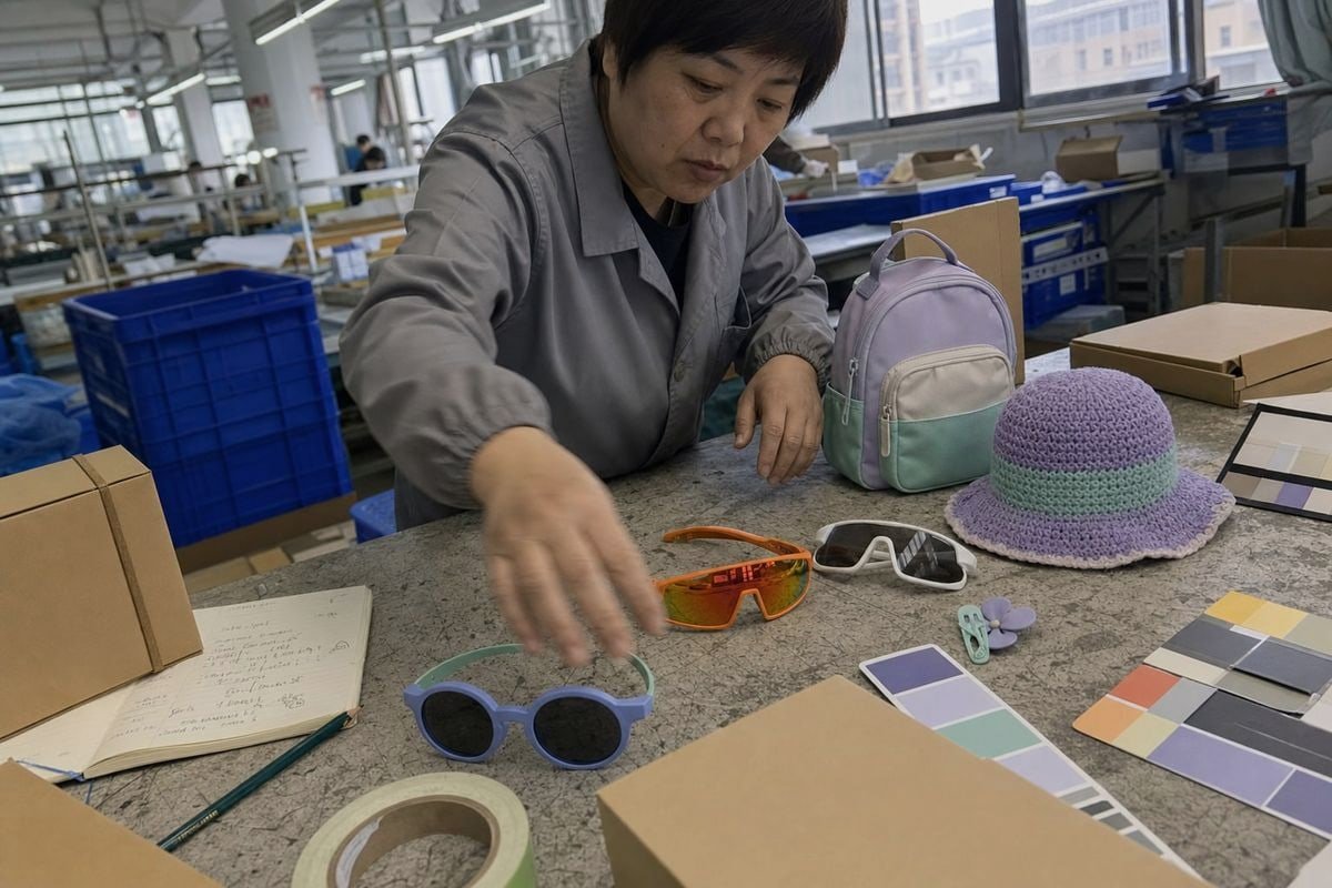
Matching kids’ sunglasses colors to an existing accessories line trips up many brands. On our production line, I have seen beautiful frames fail simply because they clashed at retail.
To match kids’ sunglasses colors to your accessories line, anchor on one system: coordinate the metal or hardware tone, echo one accent color from your existing palette, and limit each capsule to two or three colors. Use Pantone color matching for exact shades when consistency matters.
That is the short answer. Below, I will break down each step, share what works from our factory floor, and show how to do this with or without custom tooling.
How can I choose kids' sunglasses colors that complement my brand's existing palette?
A buyer from Australia once sent me her hat and backpack swatches before choosing a single frame. That one email saved her an entire round of sampling. It taught me a lot.
Start by identifying whether your palette leans warm or cool. Then pick frames that reinforce that direction: tortoise, amber, coral, and gold tones for warm lines; navy, mint, smoke, and icy translucents for cool lines. Repeat one existing brand color in the frame or temple.
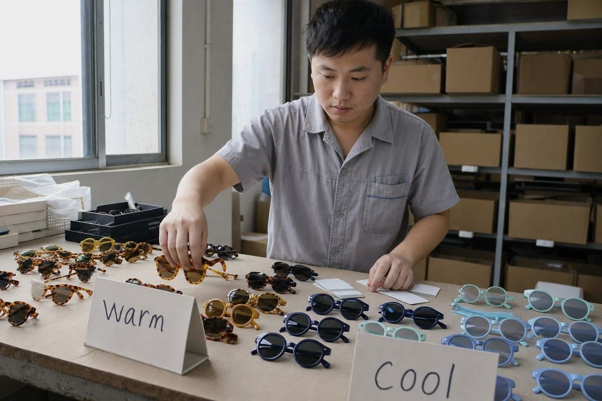
The biggest mistake I see is trying to match every single item. That leads to visual clutter. Instead, match the system, not the pieces. Your accessories line already has a color logic. Your sunglasses should plug into it, not fight it.
Warm vs. cool: the first filter
Every palette leans one way. Warm palettes use tan, coral, terracotta, amber, and gold. Cool palettes use navy, teal, sage, gray, and silver. Look at our two-tone round frame with a periwinkle-blue front and mint-teal temples. That frame belongs in a cool, calm capsule. It would look off next to a terracotta and mustard collection.
| Palette direction | Frame colors that fit | Accessory pairings |
|---|---|---|
| Warm | Tortoise, amber, coral, blush, clay | Tan hats, terracotta bags, gold-tone clips |
| Cool | Navy, mint, periwinkle, smoke, icy blue | Gray backpacks, sage headbands, silver zippers |
| Neutral bridge | Black, white, greige, translucent | Works across both directions |
Echo one accent color
Pick one color from your line and repeat it in the frame. If your bags use blush pink, the frames can be blush, coral, or deeper rose. Same family, softer harmony. This is basic color palette coordination, and it works because the eye reads repetition as intention.
Some stylists push for a precise, exact match instead. In my experience shipping to brands in 20+ countries, exact matching only pays off on strong anchor points. For everything else, same-family shades give you flexibility and keep the look fresh, not flat. That balance also supports brand aesthetic consistency without making the shelf feel rigid.
What color and material combinations work best for coordinating with accessory lines?
One trade-off we weigh constantly in our Taizhou workshop: a glossy finish photographs beautifully, but a matte rubberized texture pairs better with soft-goods accessories like silicone bracelets and neoprene bags.
The strongest combinations pair frame texture with accessory material: matte or rubberized frames with soft-touch silicone and fabric goods, glossy frames with polished hardware, and translucent frames with light, playful lines. Match hinge and logo metal tones to zipper pulls, buckles, and jewelry trim.
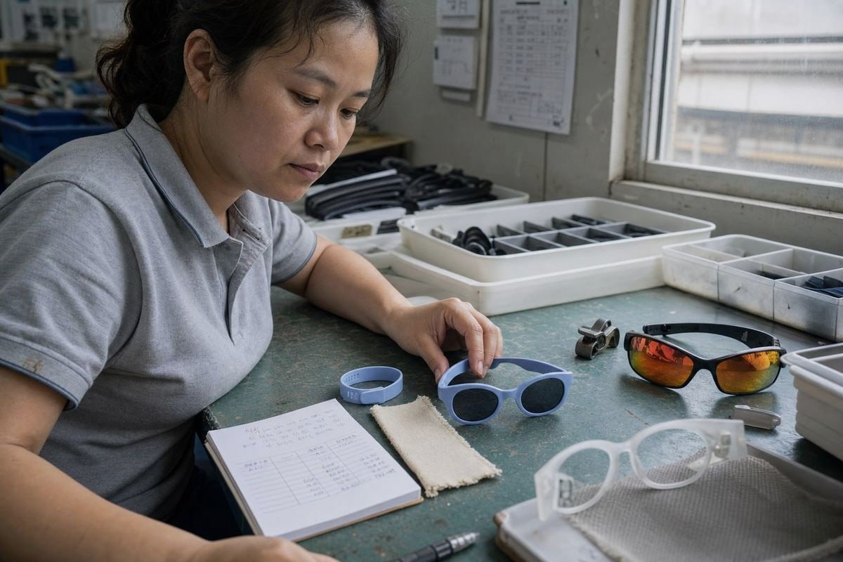
Color is only half the equation. Texture carries just as much weight on a retail shelf. When we develop montures TR90 1 with flexible TPEE temples, the finish decision comes right after the color decision, because it changes how the frame sits next to your other products.
Match hardware first
Check the small metal details on any frame: hinge screws, bridge accents, temple logos. Our periwinkle round frame uses small silver hinge screws as its only hardware. That makes it a natural partner for silver zipper pulls, snap buttons, and cool-toned trim. If your line uses gold-tone hardware, ask for gold-tone hinges or a warm frame color instead. This is the single easiest pairing rule I give buyers.
Match texture second
| Frame finish | Best accessory materials | Feel of the capsule |
|---|---|---|
| Matte / rubberized TPEE | Silicone bracelets, waterproof gear, canvas | Sporty, safe, tactile |
| Glossy plastic | Patent trims, metallic clips, party bags | Bright, playful, photo-ready |
| Translucent TR90 | Mesh, jelly bags, clear pouches | Light, summery, modern |
| Mirrored lenses | High-contrast athletic gear, helmets | Performance, high-energy |
Match use-case third
Our wraparound shield styles with orange-to-yellow mirrored lenses belong with athletic gear: sporty caps, hydration packs, high-contrast straps. The soft two-tone round frame belongs with everyday play and casual capsules. Design for the occasion, and note that acetate frame materials 2, while common in adult fashion eyewear, are usually heavier than TPEE and TR90 — which is why we favor flexible materials for active kids. Whatever the combination, protection UV400 3 stays non-negotiable; color and texture are the style layer on top of safety, never a substitute for it.
How do I select from ready-made styles to match my brand colors without custom tooling?
A Japanese buyer once assumed she needed new molds to launch eyewear under her baby brand. We walked her through our existing catalog instead, and she found three near-perfect matches in one afternoon.
Choose from a large existing style library, filter by silhouette first and color second, and shortlist frames that fall within one shade of your brand colors. With around 800 ready-made styles, most brands find close analogous matches without any mold investment or tooling cost.
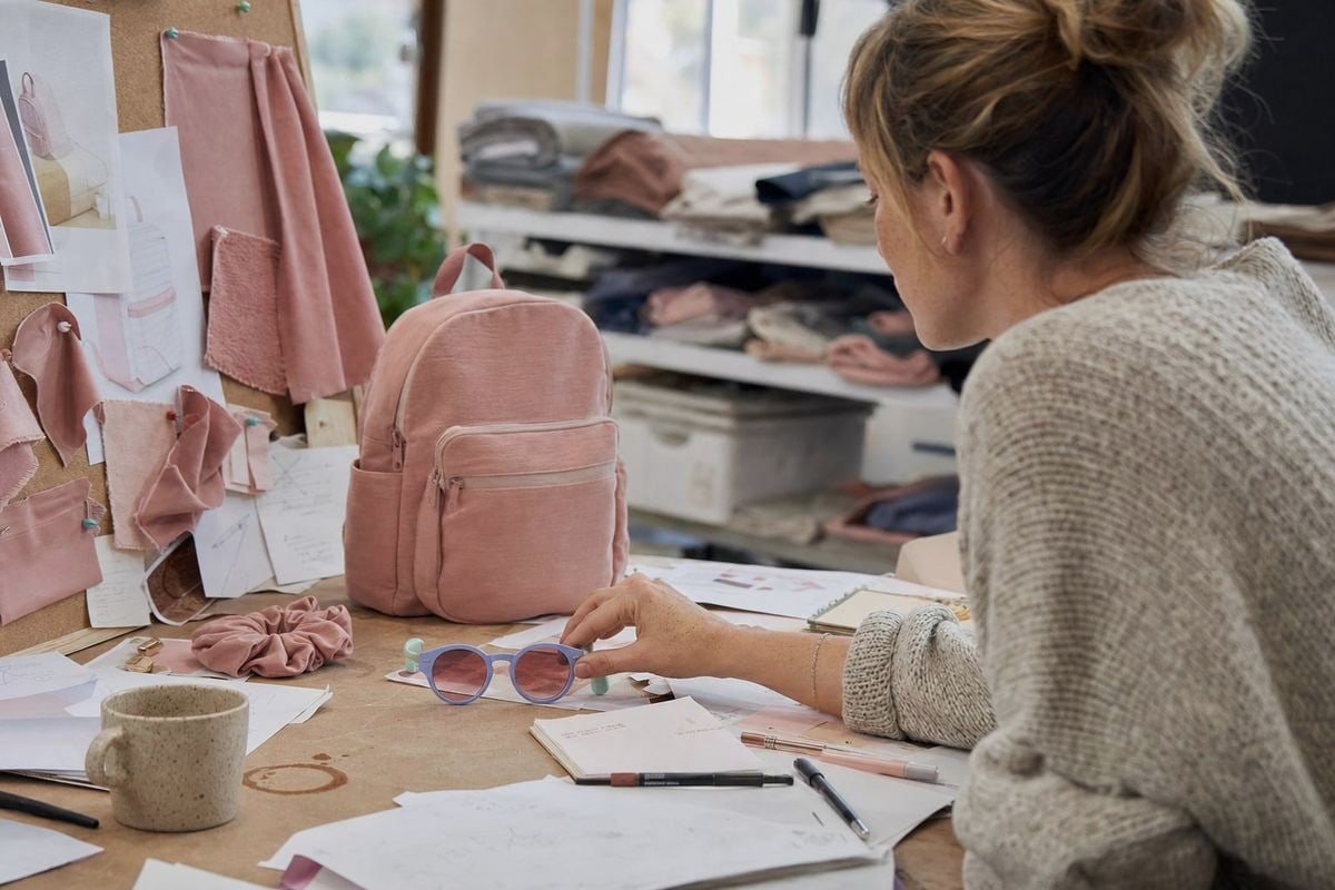
New molds cost money and time. For a first eyewear launch or a product line extension, ready-made styles let you test the market with far lower risk. The key is a smart selection process, not a lucky guess. Here is the process I walk buyers through.
- Define your anchor colors. Send us your two or three core brand colors, ideally with Références Pantone 4 or physical swatches.
- Filter by silhouette. Round frames suit soft, gentle brands. Wraparound shields suit sporty, outdoor brands. Silhouette signals brand personality faster than color does.
- Shortlist analogous shades. You will rarely find an exact off-the-shelf match. You will almost always find a neighbor on the color wheel 5 — and analogous shades usually merchandise better anyway.
- Use neutral bases as bridges. Black, white, greige, and tortoise ready-made frames pair with almost any palette. Our white-frame shield style works as a bridge neutral across bright summer drops and muted autumn headwear alike.
- Order samples and photograph them with your line. Colors behave differently next to each other than they do on a screen. Ten minutes with real samples beats hours of renders.
One more consideration: seasonal fashion trends move fast in kidswear. Ready-made styles let you react within a season — high-saturation shades for summer beachwear, earthy nature-mimicry tones like moss and clay for sustainable autumn capsules — without waiting on tooling. In wholesale eyewear manufacturing 6, that speed is often worth more than a perfect custom shade.
Can custom color options help me create a cohesive look across my product range?
The lesson that reshaped how I advise buyers came from a European client whose hats, bags, and frames each used a slightly different "brand blue." Customers noticed. Custom color development fixed it in one production run.
Yes. Custom color options let you match frames precisely to your brand palette using Pantone color matching, align two-tone combinations with your hero products, and repeat exact shades across hats, bags, and eyewear. This creates true cross-range cohesion that ready-made shades can only approximate.
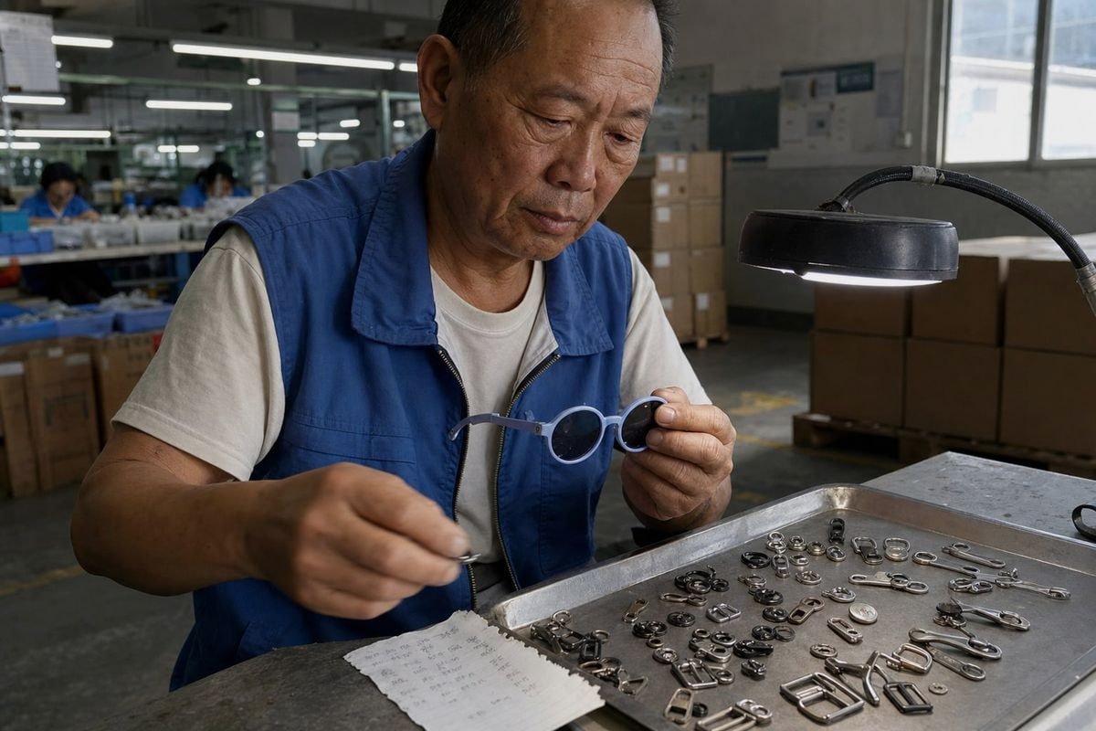
Ready-made styles get you close. Custom colors get you exact. As an OEM/ODM partner 7, we handle custom colors, logos, lenses, and packaging, and the color step is where cross-merchandising strategy really comes alive.
What can be customized
| Element | Customization option | Cohesion effect |
|---|---|---|
| Frame front | Pantone-matched pigment | Exact match to hero brand color |
| Temple arms | Second color for two-tone designs | Echoes a secondary palette shade |
| Lentilles | Tint, mirror gradient, polarized, UV400 | Ties into sporty or calm color stories |
| Hardware | Silver or warm-tone hinge finish | Aligns with jewelry and zipper trim |
| Packaging | Branded cases, pouches, hang tags | Retail-ready shelf consistency |
Where custom color earns its cost
Custom color makes the most sense in three cases. First, when your brand color is distinctive and customers recognize it. Second, when you plan repeat orders, so the development cost spreads across volume. Third, when your visual merchandising techniques depend on tight color blocking — a wall of coordinated hats, bags, and frames only works if the shades genuinely agree.
Custom color also unlocks strategic palettes ready-made ranges rarely carry. Think sensory-safe tones like soft sage or deep navy to coordinate with adaptive accessory lines, or high-chroma shades tuned to stay vibrant in social media photos and user-generated content. And because kids' styling should still leave room for fun and self-expression, my advice is to exact-match only your anchor points — the hero color and the hardware tone — and keep the rest of the capsule flexible.
Conclusion
Match the system, not every item: pick warm or cool, echo one accent, align hardware, and use ready-made styles or Pantone-matched custom colors to keep your kids' accessories line cohesive.
Notes de bas de page
1. TR90 is a nylon-based copolymer; this provides material background context. ↩︎
2. Background on cellulose acetate, the material used in fashion eyewear frames. ↩︎
3. Explains UV Index and why UV protection is essential for children’s eyewear safety. ↩︎
4. Official Pantone site defines the color matching system referenced for exact shades. ↩︎
5. Explains color wheel theory behind analogous and complementary color matching. ↩︎
6. ISO standards underpin quality and consistency in wholesale eyewear manufacturing. ↩︎
7. US trade authority resource on OEM/ODM manufacturing partnerships and sourcing. ↩︎
Plus d'articles que vous pourriez aimer

1 août 2026
L'usine doit-elle gérer l'emballage et l'étiquetage des lunettes pour enfants, ou utiliser un fournisseur désigné ?

1 août 2026
Entrepôt propre vs. exécution directe par le fournisseur : lequel réduit les coûts de retour pour les marques de lunettes pour enfants ?

1 août 2026
Entrepôt direct au port ou staging outre-mer : lequel permet d'économiser le plus sur l'expédition des lunettes pour enfants ?
Vous recherchez un partenaire fiable en lunetterie pour enfants ?
Explorez plus de 800 styles prêts et un support OEM/ODM complet adapté à votre marque.
Contactez-nous English
  Español de México
  Deutsch
  Français
  日本語
日本語  العربية
  Português do Brasil